Determining the right color palette for your living space can feel overwhelming, especially when you want every room to reflect your style while feeling balanced and inviting. In Greenville, with its mix of traditional and modern homes, the right color choices can transform your residence.
From understanding color psychology to ensuring your selections flow seamlessly throughout your home, this guide covers everything you need to know.
Start with a Purpose for Each Space
Before diving into swatches and paint samples, ask yourself: What do I want this space to feel like? Each room in your home has a different purpose, and the colors you choose can enhance that. For instance, a bedroom might call for calm, soothing tones, while a living room might benefit from warm, inviting hues.
Think about how you want to feel when you enter the room. If you’re designing a home office, for example, you might lean toward colors that promote focus, like subtle blues or soft grays. On the other hand, a dining room might shine with deeper tones that encourage conversation, like rich greens or burgundies.
When you design with intention, your colors won’t just look great — they’ll feel right, too.
Understand the Impact of Color Psychology
Colors affect mood more than you might realize. That’s why understanding color psychology can help you make informed color choices throughout your Greenville home.
Here are a few common colors and the feelings they tend to evoke:
Here are a few common colors and the feelings they tend to evoke:
- Blue: Calm, serene, and focused. Perfect for bedrooms, offices, or bathrooms.
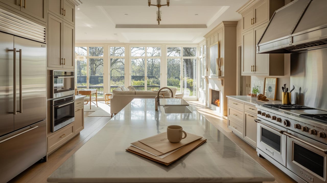
- Green: Refreshing and restorative. Works well in living rooms, kitchens, or anywhere you want a natural feel.
- Yellow: Cheerful and energizing. Great for kitchens, breakfast nooks, or small spaces needing a brightness boost.
- Gray: Sophisticated and balanced. It can act as a neutral backdrop or the main star, depending on the tone.
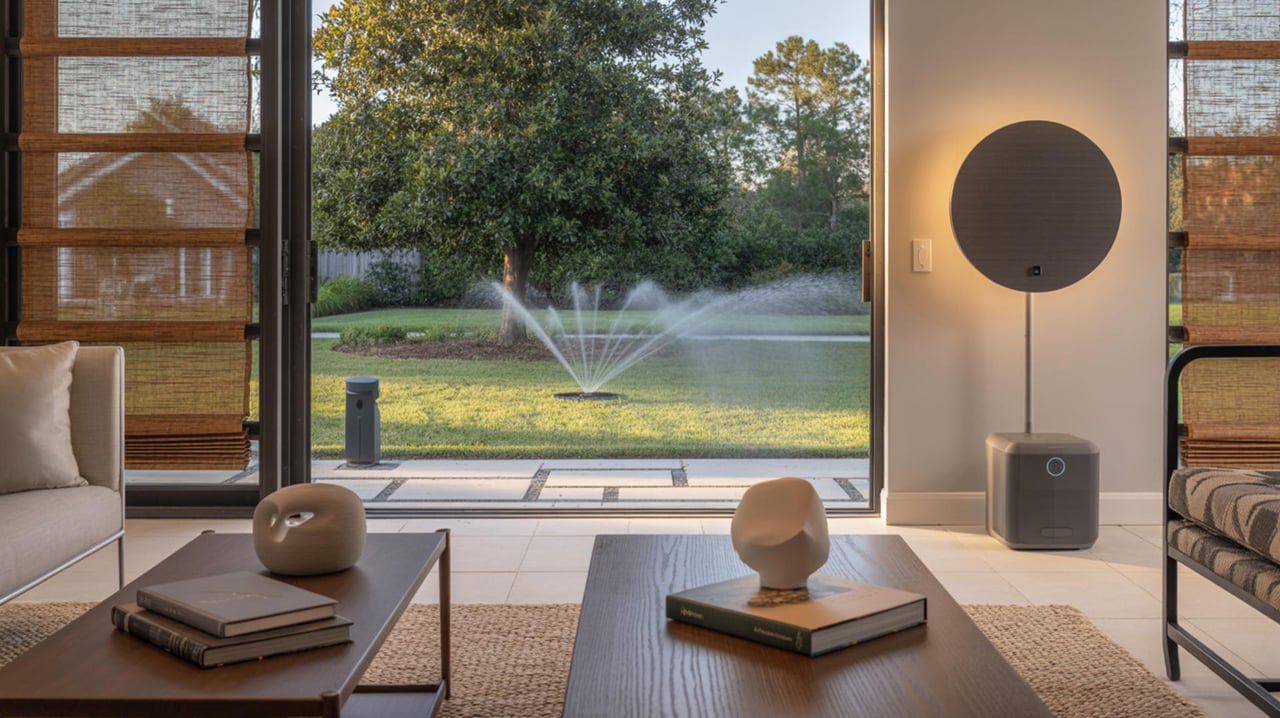
- Beige/Tan: Warm, grounding, and timeless. A versatile option for common areas like living rooms.
- Red: Bold and energetic. Use carefully in dining rooms, kitchens, or accent walls for a dynamic pop.
Consider Your Home’s Natural Lighting
Lighting can make or break a color choice. The way a shade looks under natural light during the day will differ significantly from how it appears under artificial lighting at night. Greenville homes often benefit from ample natural light, but you still need to test your chosen colors.
Here’s how you can factor lighting into your decision:
Here’s how you can factor lighting into your decision:
- North-facing rooms: These spaces often have cooler light, so warmer colors (like creamy whites or sandy neutrals) balance out the space.
- South-facing rooms: Bright, natural light makes most colors look vibrant. Cool tones, like soft blues or sage greens, can prevent the space from feeling overly warm.
- East-facing rooms: Morning light brings warmth, but by afternoon, the room can appear cooler. Warm tones like yellows or warm neutrals work best.
- West-facing rooms: Evening light creates a cozy glow, so neutral or cool colors help balance the shift throughout the day.
Create a Flow Between Rooms
When selecting a color palette, it’s important to think beyond a single room. After all, your home should feel cohesive as you move from space to space. That doesn’t mean every room needs to be the same color — far from it. Instead, focus on creating a sense of connection between your color choices.
A popular approach is choosing a base color to anchor your palette. This could be a soft gray, beige, or \white that flows throughout your home, providing balance. From there, add complementary colors in each room. For example:
A popular approach is choosing a base color to anchor your palette. This could be a soft gray, beige, or \white that flows throughout your home, providing balance. From there, add complementary colors in each room. For example:
- Use a soft gray base throughout hallways and shared spaces.
- Add deep green or navy in a living room as a bold accent.
- Choose warm beige or soft blue in bedrooms for a calming effect.
- Use pops of brighter hues like yellow or coral in small areas like bathrooms or nooks.
Draw Inspiration from Your Home’s Features
Your Greenville home may inspire your color palette. Look to its existing features — both inside and out — for guidance.
- Natural wood tones: If you have hardwood floors, exposed beams, or wooden furniture, consider colors that complement warm wood undertones, such as soft creams, deep greens, or earthy browns.
- Stone or brick: Exterior or interior stonework and brick pair beautifully with natural, muted colors like grays, beiges, or sage greens.
- Architectural details: Trim, molding, or cabinetry can act as a design anchor. Painting these in a crisp white or a contrasting color can highlight these artistic elements and add depth.
Bring It All Together
By focusing on how you want your spaces to feel, testing your options, and tying colors together throughout your Greenville home, you can create a look that feels cohesive and distinctly you. With proper planning, you’ll land on a palette that transforms your home into a beautiful, inviting space you love. Contact Kristina Harris if you’re ready to explore your real estate options in Greenville, NC.